The following space lists all the packages I used for this exercise:
library(dslabs)library(tidyverse)
── Attaching core tidyverse packages ──────────────────────── tidyverse 2.0.0 ──
✔ dplyr     1.1.3     ✔ readr     2.1.4
✔ forcats   1.0.0     ✔ stringr   1.5.0
✔ ggplot2   3.4.4     ✔ tibble    3.2.1
✔ lubridate 1.9.3     ✔ tidyr     1.3.0
✔ purrr     1.0.2
── Conflicts ────────────────────────────────────────── tidyverse_conflicts() ──
✖ dplyr::filter() masks stats::filter()
✖ dplyr::lag()    masks stats::lag()
ℹ Use the conflicted package (<http://conflicted.r-lib.org/>) to force all conflicts to become errors
I explored the gapminder dataset from the dslabs package using the help() function to pull out the help page that describes the dataset
help("gapminder")
starting httpd help server ... done
I explored the structure of the dataset using the str() function, the summary using the summary() function and used the class() function to check the type of object for this dataset.
str(gapminder)
'data.frame':   10545 obs. of  9 variables:
 $ country         : Factor w/ 185 levels "Albania","Algeria",..: 1 2 3 4 5 6 7 8 9 10 ...
 $ year            : int  1960 1960 1960 1960 1960 1960 1960 1960 1960 1960 ...
 $ infant_mortality: num  115.4 148.2 208 NA 59.9 ...
 $ life_expectancy : num  62.9 47.5 36 63 65.4 ...
 $ fertility       : num  6.19 7.65 7.32 4.43 3.11 4.55 4.82 3.45 2.7 5.57 ...
 $ population      : num  1636054 11124892 5270844 54681 20619075 ...
 $ gdp             : num  NA 1.38e+10 NA NA 1.08e+11 ...
 $ continent       : Factor w/ 5 levels "Africa","Americas",..: 4 1 1 2 2 3 2 5 4 3 ...
 $ region          : Factor w/ 22 levels "Australia and New Zealand",..: 19 11 10 2 15 21 2 1 22 21 ...
summary(gapminder)
                country           year      infant_mortality life_expectancy
 Albania            :   57   Min.   :1960   Min.   :  1.50   Min.   :13.20
 Algeria            :   57   1st Qu.:1974   1st Qu.: 16.00   1st Qu.:57.50
 Angola             :   57   Median :1988   Median : 41.50   Median :67.54
 Antigua and Barbuda:   57   Mean   :1988   Mean   : 55.31   Mean   :64.81
 Argentina          :   57   3rd Qu.:2002   3rd Qu.: 85.10   3rd Qu.:73.00
 Armenia            :   57   Max.   :2016   Max.   :276.90   Max.   :83.90
 (Other)            :10203                  NA's   :1453
   fertility       population             gdp               continent
 Min.   :0.840   Min.   :3.124e+04   Min.   :4.040e+07   Africa  :2907
 1st Qu.:2.200   1st Qu.:1.333e+06   1st Qu.:1.846e+09   Americas:2052
 Median :3.750   Median :5.009e+06   Median :7.794e+09   Asia    :2679
 Mean   :4.084   Mean   :2.701e+07   Mean   :1.480e+11   Europe  :2223
 3rd Qu.:6.000   3rd Qu.:1.523e+07   3rd Qu.:5.540e+10   Oceania : 684
 Max.   :9.220   Max.   :1.376e+09   Max.   :1.174e+13
 NA's   :187     NA's   :185         NA's   :2972
             region
 Western Asia   :1026
 Eastern Africa : 912
 Western Africa : 912
 Caribbean      : 741
 South America  : 684
 Southern Europe: 684
 (Other)        :5586
class(gapminder)
[1] "data.frame"
First, I created the object africadata, which includes only observations from Africa. And then I checked the structure and summary of the new object using str() and summary()
#I used the 'filter()' function to select only the observations from Africa, using the variable 'continent'africadata <- gapminder %>%filter(continent =="Africa")#Check if the new object was correctly saved using the 'str()' and 'summary()' functionsstr(africadata)
'data.frame':   2907 obs. of  9 variables:
 $ country         : Factor w/ 185 levels "Albania","Algeria",..: 2 3 18 22 26 27 29 31 32 33 ...
 $ year            : int  1960 1960 1960 1960 1960 1960 1960 1960 1960 1960 ...
 $ infant_mortality: num  148 208 187 116 161 ...
 $ life_expectancy : num  47.5 36 38.3 50.3 35.2 ...
 $ fertility       : num  7.65 7.32 6.28 6.62 6.29 6.95 5.65 6.89 5.84 6.25 ...
 $ population      : num  11124892 5270844 2431620 524029 4829291 ...
 $ gdp             : num  1.38e+10 NA 6.22e+08 1.24e+08 5.97e+08 ...
 $ continent       : Factor w/ 5 levels "Africa","Americas",..: 1 1 1 1 1 1 1 1 1 1 ...
 $ region          : Factor w/ 22 levels "Australia and New Zealand",..: 11 10 20 17 20 5 10 20 10 10 ...
summary(africadata)
         country          year      infant_mortality life_expectancy
 Algeria     :  57   Min.   :1960   Min.   : 11.40   Min.   :13.20
 Angola      :  57   1st Qu.:1974   1st Qu.: 62.20   1st Qu.:48.23
 Benin       :  57   Median :1988   Median : 93.40   Median :53.98
 Botswana    :  57   Mean   :1988   Mean   : 95.12   Mean   :54.38
 Burkina Faso:  57   3rd Qu.:2002   3rd Qu.:124.70   3rd Qu.:60.10
 Burundi     :  57   Max.   :2016   Max.   :237.40   Max.   :77.60
 (Other)     :2565                  NA's   :226
   fertility       population             gdp               continent
 Min.   :1.500   Min.   :    41538   Min.   :4.659e+07   Africa  :2907
 1st Qu.:5.160   1st Qu.:  1605232   1st Qu.:8.373e+08   Americas:   0
 Median :6.160   Median :  5570982   Median :2.448e+09   Asia    :   0
 Mean   :5.851   Mean   : 12235961   Mean   :9.346e+09   Europe  :   0
 3rd Qu.:6.860   3rd Qu.: 13888152   3rd Qu.:6.552e+09   Oceania :   0
 Max.   :8.450   Max.   :182201962   Max.   :1.935e+11
 NA's   :51      NA's   :51          NA's   :637
                       region
 Eastern Africa           :912
 Western Africa           :912
 Middle Africa            :456
 Northern Africa          :342
 Southern Africa          :285
 Australia and New Zealand:  0
 (Other)                  :  0
Here, I created two new objects. africachild contains only the variables infant_mortality and life_expectancy, meanwhile africapop contains the population and life_expectancy variables. To do this I used the select() function. And then I explored the structure and summary of both new objects using str() and summary() to check if the objects were correctly created.
#Creating new objects, using the 'select()' function to choose only the variables I need from the original datasetafricachild <- africadata %>%select(c(infant_mortality, life_expectancy))africapop <- africadata %>%select(c(population, life_expectancy))#Using 'str()' to check the structure of the new objectsstr(africachild)
'data.frame':   2907 obs. of  2 variables:
 $ infant_mortality: num  148 208 187 116 161 ...
 $ life_expectancy : num  47.5 36 38.3 50.3 35.2 ...
str(africapop)
'data.frame':   2907 obs. of  2 variables:
 $ population     : num  11124892 5270844 2431620 524029 4829291 ...
 $ life_expectancy: num  47.5 36 38.3 50.3 35.2 ...
#Using 'summary()' to check the summary of the new objectssummary(africachild)
 infant_mortality life_expectancy
 Min.   : 11.40   Min.   :13.20
 1st Qu.: 62.20   1st Qu.:48.23
 Median : 93.40   Median :53.98
 Mean   : 95.12   Mean   :54.38
 3rd Qu.:124.70   3rd Qu.:60.10
 Max.   :237.40   Max.   :77.60
 NA's   :226
summary(africapop)
   population        life_expectancy
 Min.   :    41538   Min.   :13.20
 1st Qu.:  1605232   1st Qu.:48.23
 Median :  5570982   Median :53.98
 Mean   : 12235961   Mean   :54.38
 3rd Qu.: 13888152   3rd Qu.:60.10
 Max.   :182201962   Max.   :77.60
 NA's   :51
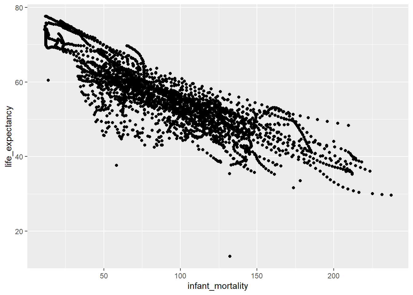
Now, I created a graph that illustrates life expectancy as a function of child mortality using ggplot(), with the africachild object.
#Plotting life expenctancy as a function of infant mortality, using the 'ggplot()' package, in this case I used a point geometry using 'geom_point()'ggplot(data= africachild, aes(x= infant_mortality, y= life_expectancy))+geom_point()
It is observed that there is a negative correlation between infant mortality and life expectancy.
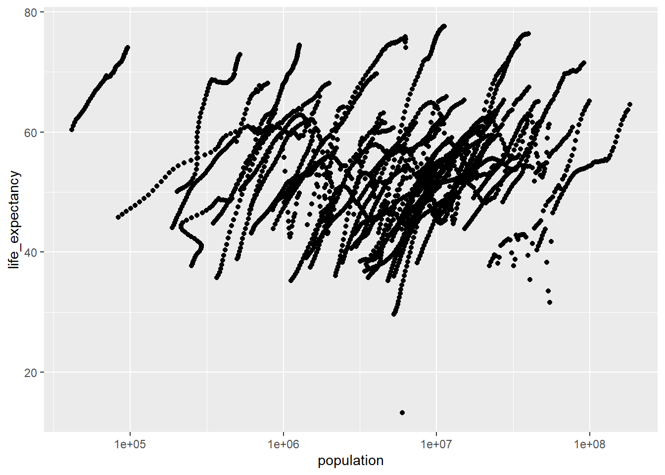
And here, I created a graph that shows life expectancy as a function of population using ggplot(), with the africapop object.
#I used the 'geom_point()' geometry to plot the data points and set the x-axis to log scale using 'scale_x_log10()'.ggplot(data= africapop ,aes(x= population, y= life_expectancy))+geom_point()+scale_x_log10()
There is a positive correlation between life expectancy and population size, however there can be observed some weird ‘streaks’. If looking at the original dataset, this includes the population size from 1960 to 2016, so there are actually many years of observations instead of just one.
I noticed there are years with missing data (NAs). To figure out which years have missing data I used the is.na() function in combination with filter().
#Use `filter(is.na(infant_mortality)) to filter all observation that have missing values (NAs). Then I used 'count(year)', to summarize which years have the selected missing data.africadata %>%filter(is.na(infant_mortality)) %>%count(year)
There is missing info on infant mortality from the years 1960 to 1981 and 2016. So it was best to choose a specific year for the analysis. Here, I created a new object africa2000 with only data from the year 2000. Then I checked the new data frame using str() and summary()
#Create the object 'africa2000' using the 'filter()' function on the variable 'year' to select only the observations from the year 2000.africa2000 <- africadata %>%filter(year ==2000)#Check the new object using 'str()' and 'summary()'str(africa2000)
'data.frame':   51 obs. of  9 variables:
 $ country         : Factor w/ 185 levels "Albania","Algeria",..: 2 3 18 22 26 27 29 31 32 33 ...
 $ year            : int  2000 2000 2000 2000 2000 2000 2000 2000 2000 2000 ...
 $ infant_mortality: num  33.9 128.3 89.3 52.4 96.2 ...
 $ life_expectancy : num  73.3 52.3 57.2 47.6 52.6 46.7 54.3 68.4 45.3 51.5 ...
 $ fertility       : num  2.51 6.84 5.98 3.41 6.59 7.06 5.62 3.7 5.45 7.35 ...
 $ population      : num  31183658 15058638 6949366 1736579 11607944 ...
 $ gdp             : num  5.48e+10 9.13e+09 2.25e+09 5.63e+09 2.61e+09 ...
 $ continent       : Factor w/ 5 levels "Africa","Americas",..: 1 1 1 1 1 1 1 1 1 1 ...
 $ region          : Factor w/ 22 levels "Australia and New Zealand",..: 11 10 20 17 20 5 10 20 10 10 ...
summary(africa2000)
         country        year      infant_mortality life_expectancy
 Algeria     : 1   Min.   :2000   Min.   : 12.30   Min.   :37.60
 Angola      : 1   1st Qu.:2000   1st Qu.: 60.80   1st Qu.:51.75
 Benin       : 1   Median :2000   Median : 80.30   Median :54.30
 Botswana    : 1   Mean   :2000   Mean   : 78.93   Mean   :56.36
 Burkina Faso: 1   3rd Qu.:2000   3rd Qu.:103.30   3rd Qu.:60.00
 Burundi     : 1   Max.   :2000   Max.   :143.30   Max.   :75.00
 (Other)     :45
   fertility       population             gdp               continent
 Min.   :1.990   Min.   :    81154   Min.   :2.019e+08   Africa  :51
 1st Qu.:4.150   1st Qu.:  2304687   1st Qu.:1.274e+09   Americas: 0
 Median :5.550   Median :  8799165   Median :3.238e+09   Asia    : 0
 Mean   :5.156   Mean   : 15659800   Mean   :1.155e+10   Europe  : 0
 3rd Qu.:5.960   3rd Qu.: 17391242   3rd Qu.:8.654e+09   Oceania : 0
 Max.   :7.730   Max.   :122876723   Max.   :1.329e+11

                       region
 Eastern Africa           :16
 Western Africa           :16
 Middle Africa            : 8
 Northern Africa          : 6
 Southern Africa          : 5
 Australia and New Zealand: 0
 (Other)                  : 0
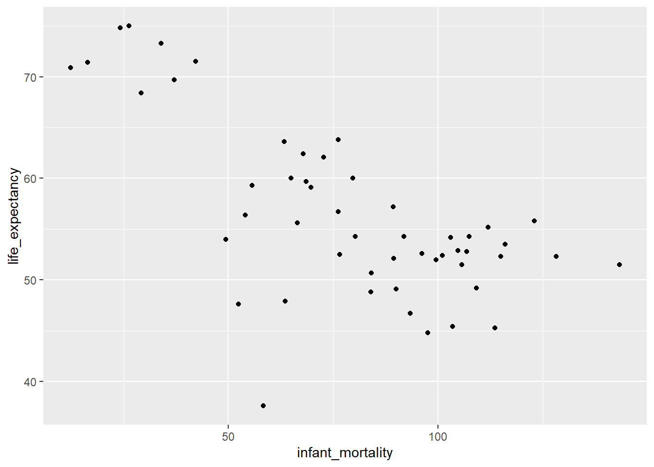
And here I made a new plot for life expectancy as a function of infant mortality for the year 2000 only.
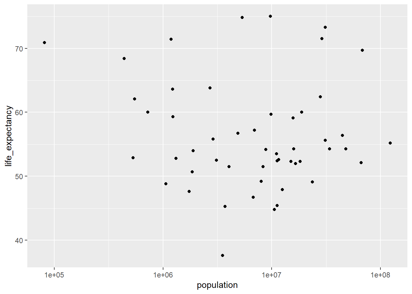
It is observed a negative association between infant mortality and life expectancy, however, the association between life expectancy and population is not clear. To do additional modeling, I tried to fit a linear model using the lm() function on the africa2000 dataset. I used life expectancy as the outcome and infant mortality as a predictor in the fit1 model, and life_expectancy also as outcome and population as the predictor in the fit2 model.
fit1 <-lm(life_expectancy ~ infant_mortality, data = africa2000)fit2 <-lm(life_expectancy ~ population, data = africa2000)
And finally I used the summary() function to look at the fit results for both models.
summary(fit1)
Call:
lm(formula = life_expectancy ~ infant_mortality, data = africa2000)

Residuals:
     Min       1Q   Median       3Q      Max
-22.6651  -3.7087   0.9914   4.0408   8.6817

Coefficients:
                 Estimate Std. Error t value Pr(>|t|)
(Intercept)      71.29331    2.42611  29.386  < 2e-16 ***
infant_mortality -0.18916    0.02869  -6.594 2.83e-08 ***
---
Signif. codes:  0 '***' 0.001 '**' 0.01 '*' 0.05 '.' 0.1 ' ' 1

Residual standard error: 6.221 on 49 degrees of freedom
Multiple R-squared:  0.4701,    Adjusted R-squared:  0.4593
F-statistic: 43.48 on 1 and 49 DF,  p-value: 2.826e-08
summary(fit2)
Call:
lm(formula = life_expectancy ~ population, data = africa2000)

Residuals:
    Min      1Q  Median      3Q     Max
-18.429  -4.602  -2.568   3.800  18.802

Coefficients:
             Estimate Std. Error t value Pr(>|t|)
(Intercept) 5.593e+01  1.468e+00  38.097   <2e-16 ***
population  2.756e-08  5.459e-08   0.505    0.616
---
Signif. codes:  0 '***' 0.001 '**' 0.01 '*' 0.05 '.' 0.1 ' ' 1

Residual standard error: 8.524 on 49 degrees of freedom
Multiple R-squared:  0.005176,  Adjusted R-squared:  -0.01513
F-statistic: 0.2549 on 1 and 49 DF,  p-value: 0.6159
Based on the fit1 model, it is observed that infant mortality is statistically associated to life expectancy (p<0.001). It seems that life expectancy decreases as infant mortality increases. However, it appears there is no association between life expectancy and population size, according to the fit2 model, given p= 0.616, so there could be a different model that explains this association.
This section is contributed by Kelly Cao
Loading and Checking Data
The following section shows that the data set us_contagious_diseases has 6 potential variables to analyze: disease (name), state, year, weeks_reporting, count (number of cases), and population. The 6 variables are reported for the following contagious diseases: Hepatitis A, Measles, Mumps, Pertussis, Polio, Rubella, and Smallpox for the US states.
#Installing and loading needed packages with the command install.packages() and the library() functionlibrary("dslabs")library(renv)library(tidyverse)#The help() function is used to look at data provided in 'us_contagious_diseases'help(us_contagious_diseases)#Check the summary, class, and structure of the data set 'us_contagious_diseases'str(us_contagious_diseases)
        disease            state            year      weeks_reporting
 Hepatitis A:2346   Alabama   :  315   Min.   :1928   Min.   : 0.00
 Measles    :3825   Alaska    :  315   1st Qu.:1950   1st Qu.:31.00
 Mumps      :1785   Arizona   :  315   Median :1975   Median :46.00
 Pertussis  :2856   Arkansas  :  315   Mean   :1971   Mean   :37.38
 Polio      :2091   California:  315   3rd Qu.:1990   3rd Qu.:50.00
 Rubella    :1887   Colorado  :  315   Max.   :2011   Max.   :52.00
 Smallpox   :1275   (Other)   :14175
     count          population
 Min.   :     0   Min.   :   86853
 1st Qu.:     7   1st Qu.: 1018755
 Median :    69   Median : 2749249
 Mean   :  1492   Mean   : 4107584
 3rd Qu.:   525   3rd Qu.: 4996229
 Max.   :132342   Max.   :37607525
                  NA's   :214
class(us_contagious_diseases)
[1] "data.frame"
Processing and Cleaning Data
I chose to use the count, weeks_reporting, and disease columns to process and clean. After processing, the disease_count object was created to represent the columns of count and disease. No further filtering was performed on that object. Another object, Weeks_Count, is used to represent count and weeks_reporting. In addition to the select() function used to select the two columns, the filter() function was used to remove any rows that had weeks_reporting= 0, as that suggest no reporting was done for those selected data points. After that was excluded, 288 observations were left in the Weeks_Count object.
#An object is created that includes only data from the state of Georgia using the pipe operator and the filter() function.Georgia_data <- us_contagious_diseases %>%filter(state =='Georgia')#The str() and summary() function is used to verify that the object was made correctlystr(Georgia_data)
        disease          state          year      weeks_reporting
 Hepatitis A:46   Georgia   :315   Min.   :1928   Min.   : 0.00
 Measles    :75   Alabama   :  0   1st Qu.:1950   1st Qu.:33.00
 Mumps      :35   Alaska    :  0   Median :1975   Median :45.00
 Pertussis  :56   Arizona   :  0   Mean   :1971   Mean   :37.66
 Polio      :41   Arkansas  :  0   3rd Qu.:1990   3rd Qu.:49.00
 Rubella    :37   California:  0   Max.   :2011   Max.   :52.00
 Smallpox   :25   (Other)   :  0
     count           population
 Min.   :    0.0   Min.   :2901933
 1st Qu.:    8.5   1st Qu.:3444578
 Median :   42.0   Median :5009127
 Mean   :  643.0   Mean   :5235135
 3rd Qu.:  352.0   3rd Qu.:6478216
 Max.   :22965.0   Max.   :9830160
#Another object is created with 'weeks_reporting' and 'count'. This will group the total number of reported cases with the number of weeks counts were reported for that year. The rows that had 0 in "weeks_reporting" were excluded with the filter() function.Weeks_Count <-select(Georgia_data, weeks_reporting, count) %>%filter(weeks_reporting !=0)#The str() and summary() function is used to verify that the object was made correctlystr(Weeks_Count)
'data.frame':   288 obs. of  2 variables:
 $ weeks_reporting: num  47 51 50 48 51 50 47 50 48 48 ...
 $ count          : num  509 922 990 750 763 ...
summary(Weeks_Count)
 weeks_reporting     count
 Min.   : 1.00   Min.   :    0.0
 1st Qu.:37.00   1st Qu.:   16.0
 Median :46.00   Median :   55.5
 Mean   :41.19   Mean   :  703.2
 3rd Qu.:50.00   3rd Qu.:  468.8
 Max.   :52.00   Max.   :22965.0
#Another object is created with 'disease' and 'count', which would group the disease type with the total number of reported cases in Georgia into one object. disease_count<-select(Georgia_data, count, disease)#The str() and summary() function is used to verify that the object was made correctlystr(disease_count)
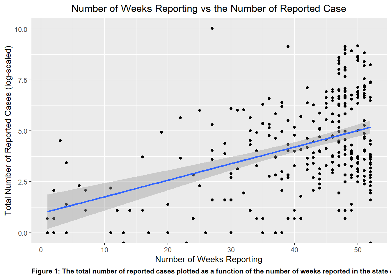
I plotted the Weeks_Count object as a scatter plot, with the total number of reported cases being plotted as a function of the number of weeks reported in the state of Georgia. When fully plotted with a line of best fit, visually, there appears to be a positive correlation between the number of reported case and the number of weeks that the counts were reported, which makes logical sense. The total number of cases reported will increase when the time that is used to collect the reported response increase.
#Using the package ggplot2 (which is found in tidyverse) to create a scatter plot using the variables in the object 'Weeks_Count' and assigning it to the variable 'p1p1 <-ggplot(Weeks_Count, aes(x = weeks_reporting, y =log(count))) +geom_point()+geom_smooth(method ="lm")+ggtitle('Number of Weeks Reporting vs the Number of Reported Case')+theme(plot.title=element_text(hjust=0.5))+xlab('Number of Weeks Reporting')+ylab('Total Number of Reported Cases (log-scaled)')+labs(caption ="Figure 1: The total number of reported cases plotted as a function of the number of weeks reported in the state of Georgia")+theme(plot.caption =element_text(hjust=0, face="bold"))#The theme() function was a great way to manipulate the specific element in the plot, whether it was color, size, or orientation of the text or visuals.#Using the plot() function to determine if the plot was properly createdplot(p1)
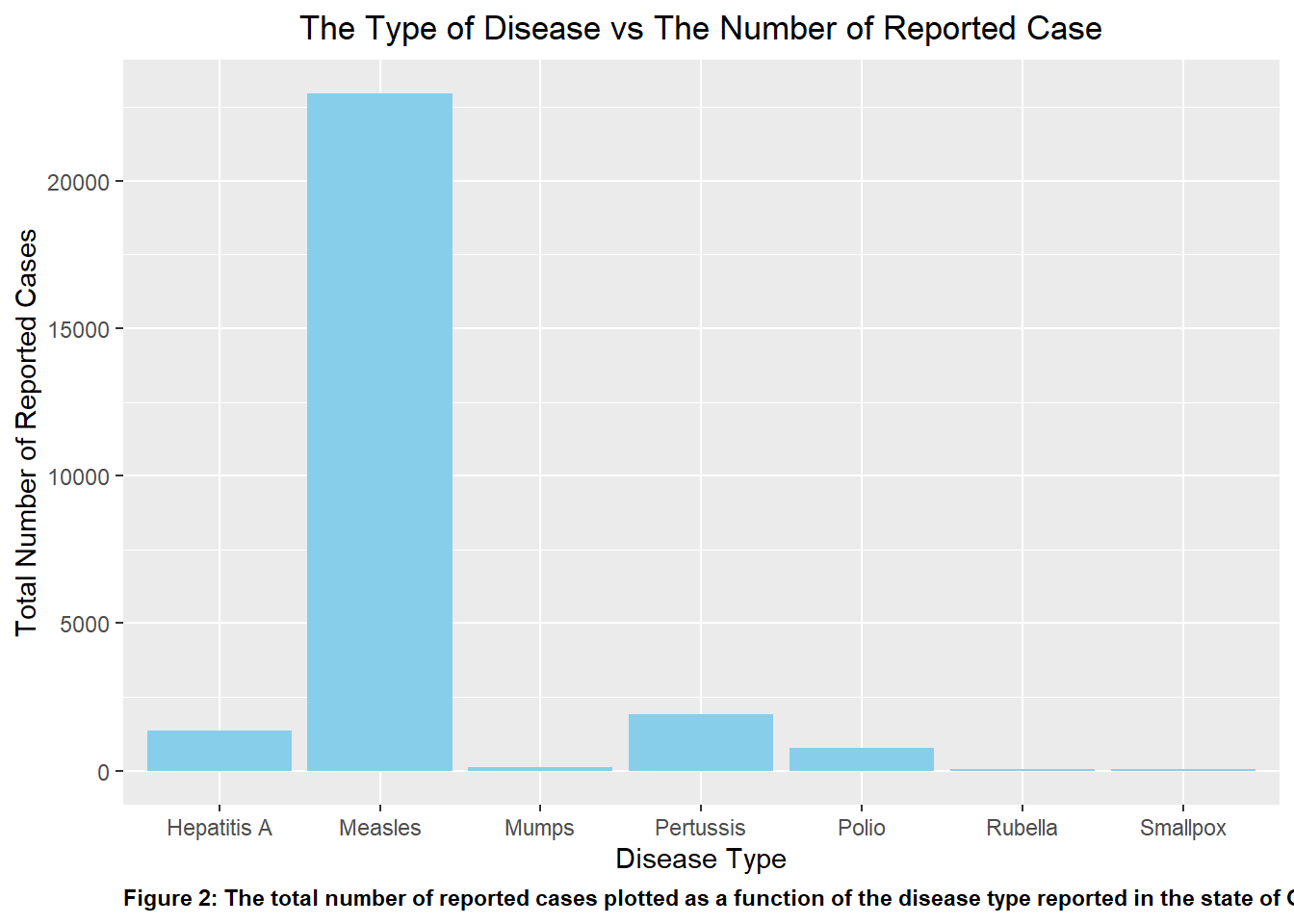
Similar to P1, I initially plotted disease_count as a bar graph to visualize the number of reported cases per disease type. This is shown in p2. Upon initial observation of the graph, it is clear that compared to the other disease listed, Measles easily acted as an outlier in the data set with the greatest number of reported case by far. This is followed by Pertussis and Hepatitis A.
#Repeating the previous two steps to plot 'disease_count' in 'p2'p2 <-ggplot(disease_count, aes(x = disease, y = count)) +geom_bar(stat ="identity", position ="dodge", fill ="skyblue")+ggtitle('The Type of Disease vs The Number of Reported Case')+theme(plot.title=element_text(hjust=0.5))+xlab('Disease Type')+ylab('Total Number of Reported Cases')+labs(caption ="Figure 2: The total number of reported cases plotted as a function of the disease type reported in the state of Georgia")+theme(plot.caption =element_text(hjust=0, face="bold"))#print the plotplot(p2)
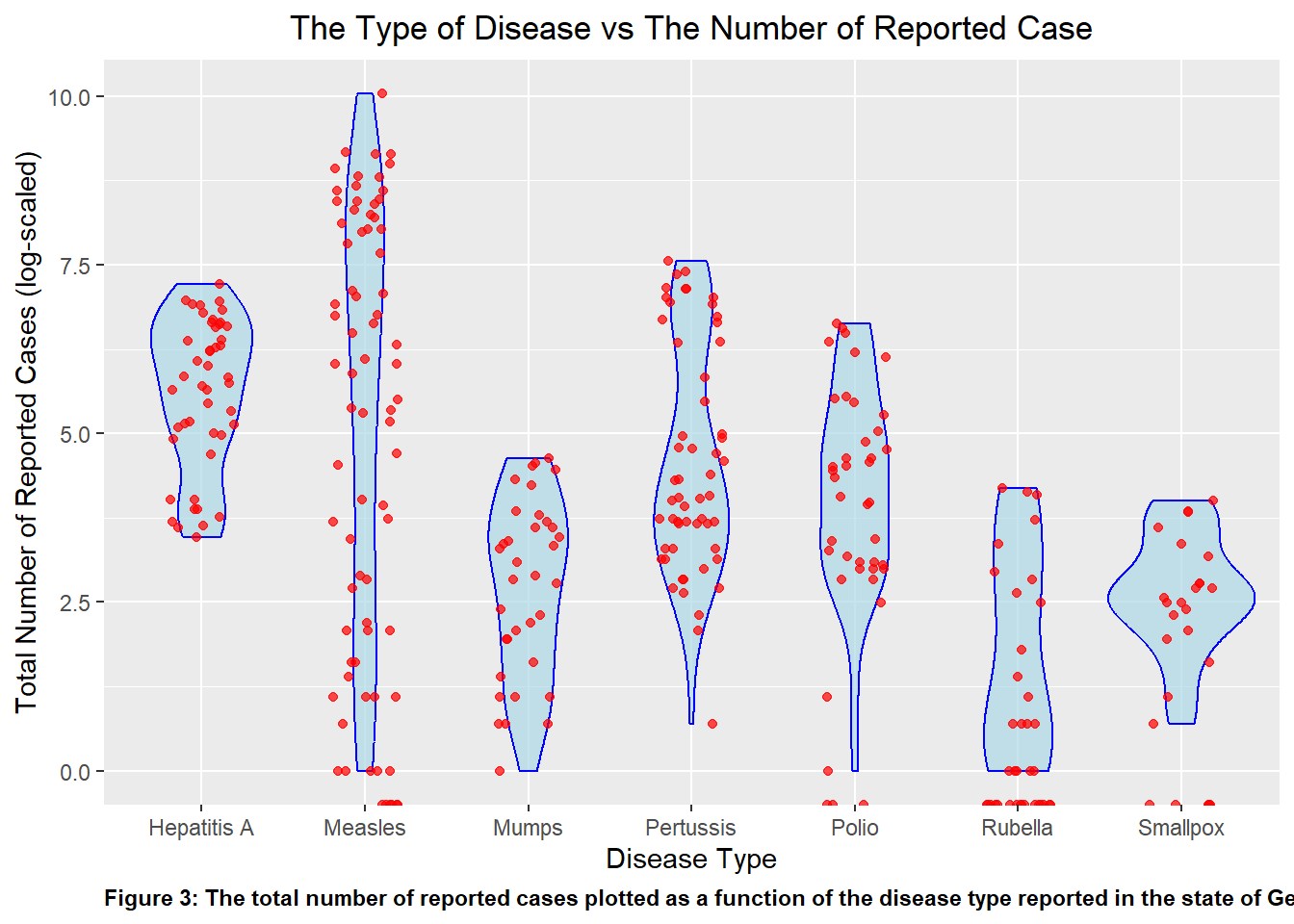
As I was unable to discern any valuable information for the disease Smallpox or Rubella due to the scaling, I replotted the graph as a violin plot overlayed with plot points to better visualize the spread of the data over the different disease while accounting for the outlier that caused the scaling issue. I plotted this as p2_2.The violin plot showed the data distribution and the density of each variable. The individual data points overlaps it for more visual clarity.
#When looking at the previous plot, there is a distinct outlier for the Measles category, thus making it difficult to determine the value that's provided from the other disease. To combat that, another plot was created to improve the clarity of the visualization of the same data set.p2_2 <-ggplot(disease_count, aes(x = disease, y =log(count))) +geom_violin(fill ="lightblue", color ="blue", alpha =0.7) +geom_jitter(width =0.2, color ="red", alpha =0.7) +ggtitle('The Type of Disease vs The Number of Reported Case')+theme(plot.title=element_text(hjust=0.5))+xlab('Disease Type')+ylab('Total Number of Reported Cases (log-scaled)')+labs(caption ="Figure 3: The total number of reported cases plotted as a function of the disease type reported in the state of Georgia")+theme(plot.caption =element_text(hjust=0, face="bold"))#print the plotplot(p2_2)
Additional plot for fun
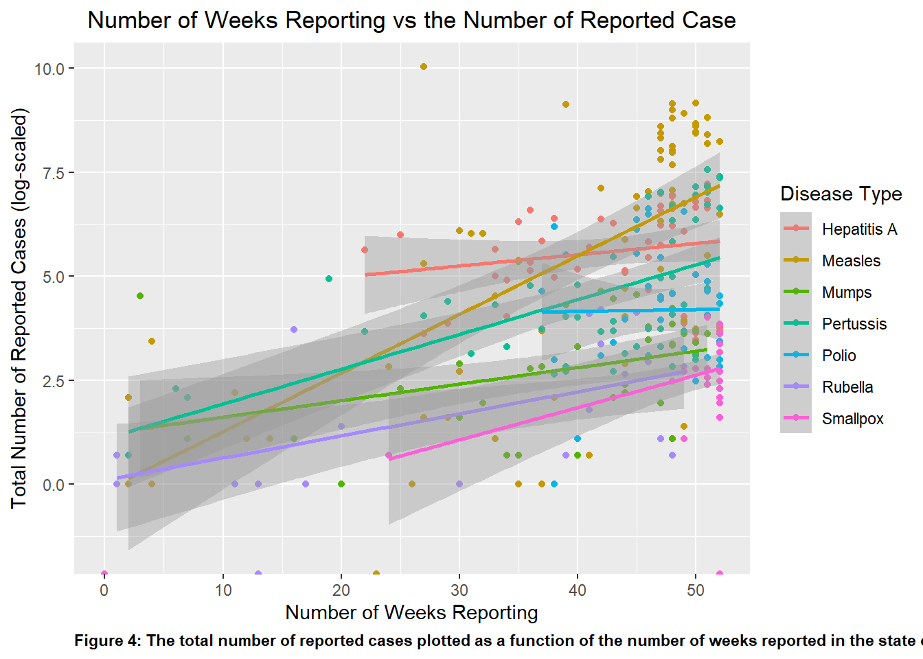
Looking at Figure 4, one can see that aside from Polio all of the other diseases listed show a upward positive trend. This suggests that Polio have little change case reported despite the time elapse, which aligns with historical and public vaccination efforts. Looking at Measles, it showed the greatest positive slope, showing the greatest growth in number of case over some set of time, which corroborates what is shown in Figure 2.
#Replotting p1 with clearly assigned data point to disease variable. Compared to p1, I added color and a legend to the points to distinguish which data point represent which disease type. p4 <-ggplot(Georgia_data, aes(x = weeks_reporting, y =log(count), color = disease, label = disease)) +geom_point()+geom_smooth(method ="lm")+ggtitle('Number of Weeks Reporting vs the Number of Reported Case')+theme(plot.title=element_text(hjust=0.5))+xlab('Number of Weeks Reporting')+ylab('Total Number of Reported Cases (log-scaled)')+labs(caption ="Figure 4: The total number of reported cases plotted as a function of the number of weeks reported in the state of Georgia")+theme(plot.caption =element_text(hjust=0, face="bold"))+labs(color ="Disease Type")#The theme() function was a great way to manipulate the specific element in the plot, whether it was color, size, or orientation of the text or visuals.#Using the plot() function to determine if the plot was properly createdplot(p4)
Analysis and Conclusion
I then fitted both objects to a linear model, with count as thte outcome for both models and weeks_reporting and disease as the predictor respectively.
Based on the results of the linear model analysis, both models seem fairly reliable with lmfit2 having the edge.
The second model has a higher R-squared, suggesting that it explains a larger proportion of variance in the response variable. The F-statistic is greater in this model, indicating a better overall fit.
The low p-value for lmfit1 suggests that weeks_reporting may have some significance in predicting the outcome count. The same is especially true for the second model.
The lmfit2 model also had a lower residual standard error compared to lmfit1, further suggesting that the second model’s prediction are closer to the actual value on average.
Based on the following observation, lmfit2 appears to perform as the better model, with a more significant predictor, a higher proportion of explained variance, a higher F-statistic, and a lower residual standard error.
#Fitting the data set to a linear model with 'count' as the outcome and 'weekly_reporting' as the predictorlmfit1 <-lm(count ~ weeks_reporting, Weeks_Count)#Use the summary() command to check over the fit summary(lmfit1)
Call:
lm(formula = count ~ weeks_reporting, data = Weeks_Count)

Residuals:
    Min      1Q  Median      3Q     Max
 -910.6  -761.0  -519.6   -99.6 22533.8

Coefficients:
                Estimate Std. Error t value Pr(>|t|)
(Intercept)      -86.531    421.657  -0.205   0.8375
weeks_reporting   19.175      9.821   1.952   0.0519 .
---
Signif. codes:  0 '***' 0.001 '**' 0.01 '*' 0.05 '.' 0.1 ' ' 1

Residual standard error: 2020 on 286 degrees of freedom
Multiple R-squared:  0.01315,   Adjusted R-squared:  0.009702
F-statistic: 3.812 on 1 and 286 DF,  p-value: 0.05187
#Fitting the data set to a linear model with 'count' as the outcome and 'disease' as the predictorlmfit2 <-lm(count ~ disease, disease_count)#Use the summary() command to check over the fit summary(lmfit2)
Call:
lm(formula = count ~ disease, data = disease_count)

Residuals:
    Min      1Q  Median      3Q     Max
-2073.1  -306.5   -21.2    31.7 20891.9

Coefficients:
                 Estimate Std. Error t value Pr(>|t|)
(Intercept)        431.13     263.86   1.634    0.103
diseaseMeasles    1642.02     335.15   4.899 1.56e-06 ***
diseaseMumps      -401.93     401.41  -1.001    0.317
diseasePertussis   -85.09     356.11  -0.239    0.811
diseasePolio      -282.76     384.37  -0.736    0.462
diseaseRubella    -421.78     395.20  -1.067    0.287
diseaseSmallpox   -415.81     444.67  -0.935    0.350
---
Signif. codes:  0 '***' 0.001 '**' 0.01 '*' 0.05 '.' 0.1 ' ' 1

Residual standard error: 1790 on 308 degrees of freedom
Multiple R-squared:  0.1744,    Adjusted R-squared:  0.1583
F-statistic: 10.84 on 6 and 308 DF,  p-value: 5.986e-11