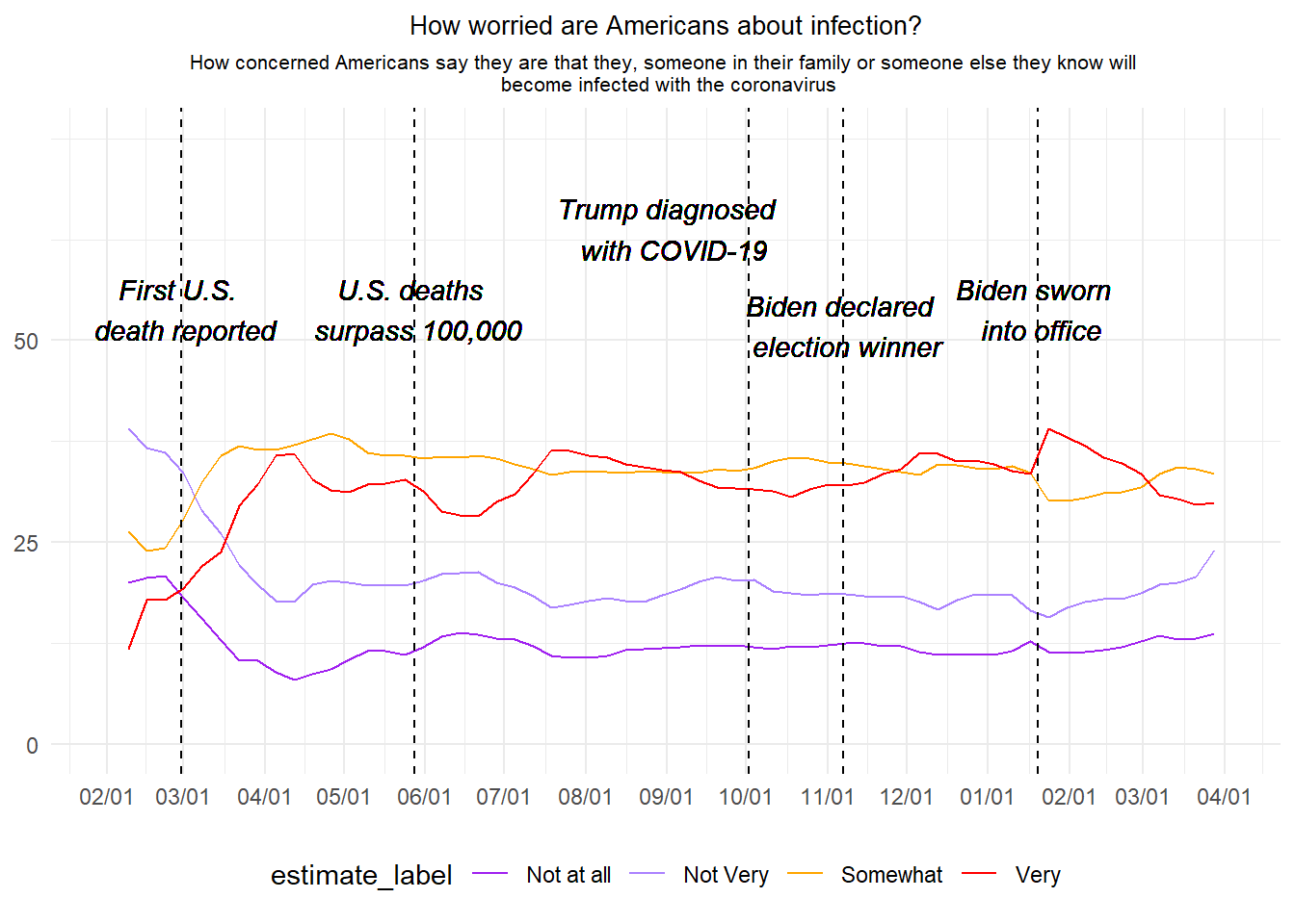
For this exercise I chose the third graph from the “How Americans view Biden’s response to the coronavirus crisis” article from FiveThirtyEight (https://projects.fivethirtyeight.com/coronavirus-polls/). The graph is a time trend on how americans were worried about they or someone beloved to getting infected with COVID-19, from February 2020 to April 2021. To recreate the graph I used the RTutor AI online tool, where after many attempts I was given a product that worked but still, I had to make some small tweaks to make the graph more alike the original one.
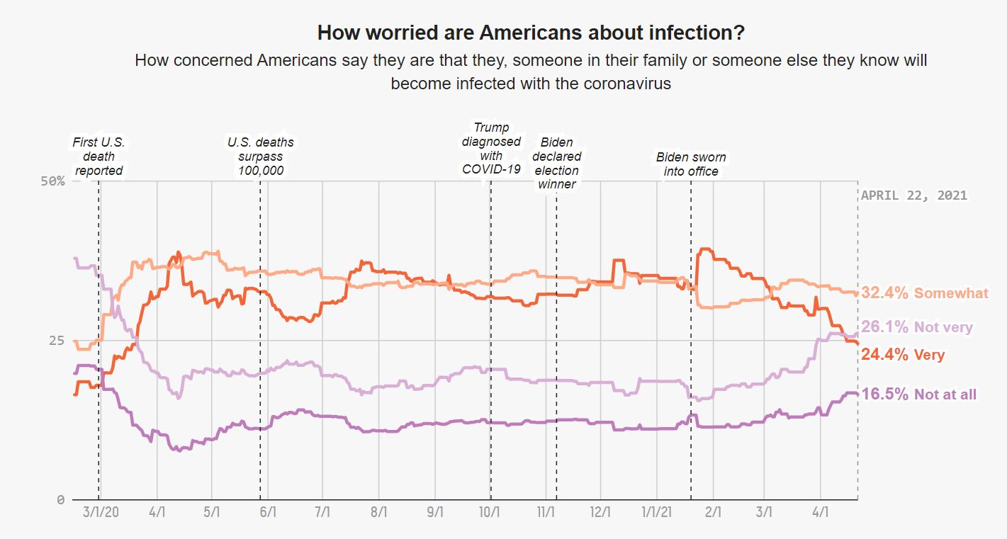
This is the original graph from the article:
[]
Packages I used for this exercise:
library(tidyverse)
Warning: package 'tidyverse' was built under R version 4.2.3
Warning: package 'ggplot2' was built under R version 4.2.3
Warning: package 'tibble' was built under R version 4.2.3
Warning: package 'tidyr' was built under R version 4.2.3
Warning: package 'readr' was built under R version 4.2.3
Warning: package 'purrr' was built under R version 4.2.3
Warning: package 'dplyr' was built under R version 4.2.3
Warning: package 'stringr' was built under R version 4.2.3
Warning: package 'forcats' was built under R version 4.2.3
Warning: package 'lubridate' was built under R version 4.2.3
── Attaching core tidyverse packages ──────────────────────── tidyverse 2.0.0 ──
✔ dplyr     1.1.4     ✔ readr     2.1.5
✔ forcats   1.0.0     ✔ stringr   1.5.0
✔ ggplot2   3.4.4     ✔ tibble    3.2.1
✔ lubridate 1.9.3     ✔ tidyr     1.3.0
✔ purrr     1.0.2
── Conflicts ────────────────────────────────────────── tidyverse_conflicts() ──
✖ dplyr::filter() masks stats::filter()
✖ dplyr::lag()    masks stats::lag()
ℹ Use the conflicted package (<http://conflicted.r-lib.org/>) to force all conflicts to become errors
library(scales)
Warning: package 'scales' was built under R version 4.2.3
Attaching package: 'scales'

The following object is masked from 'package:purrr':

    discard

The following object is masked from 'package:readr':

    col_factor
library(here)
Warning: package 'here' was built under R version 4.2.3
here() starts at C:/Users/malik/Documents/1. UGA Classes/15. Malika Spring 2024/MADASpring_24/erickmollinedo-MADA-portfolio
library(readr)library(lubridate)
Loading the dataset and assign it to the covid_poll object:
#Using the `read_csv()` and `here()` functions to load the datasetcovid_poll <-read_csv(here("presentation-exercise", "data", "covid_concern_toplines.csv"))
Rows: 1496 Columns: 8
── Column specification ────────────────────────────────────────────────────────
Delimiter: ","
chr (4): subject, modeldate, party, timestamp
dbl (4): very_estimate, somewhat_estimate, not_very_estimate, not_at_all_est...

ℹ Use `spec()` to retrieve the full column specification for this data.
ℹ Specify the column types or set `show_col_types = FALSE` to quiet this message.
First I transformed the modeldate variable to date type using the lubridate package. I assigned it to the covid_infect dataframe. I also filtered only the responses needed for the graph, from the subject variable.
# Transform 'modeldate' to date type and filter the datacovid_infect <- covid_poll %>%mutate(modeldate =mdy(modeldate)) %>%#Mutate the `modeldate` variable to month/day/yearfilter(modeldate <as.Date("2021-04-22") & subject =='concern-infected') #Transform the `modeldate` variable as date type and filter the 'concern-infected' value from the `subject` variable.
Now I decided to produce weekly averages, instead of using the daily datapoints, I assigned this to the covid_weekly dataframe
# Calculate weekly averages of the estimatescovid_weekly <- covid_infect %>%group_by(week =floor_date(modeldate, "week")) %>%#Group by weekssummarize( #Produce the summaries for each response variable (4 code lines below)very_estimate =mean(very_estimate, na.rm =TRUE),somewhat_estimate =mean(somewhat_estimate, na.rm =TRUE),not_very_estimate =mean(not_very_estimate, na.rm =TRUE),not_at_all_estimate =mean(not_at_all_estimate, na.rm =TRUE),.groups ='drop')
Then I created the covid_longer dataframe using the pivot_longer() function, so the data is more easy to be used for the final graph.
# Pivot data to long format for plottingcovid_longer <- covid_weekly %>%pivot_longer(cols =c(very_estimate, somewhat_estimate, not_very_estimate, not_at_all_estimate), #Use `pivot_longer()` to mutate the dataframenames_to ="estimate_type",values_to ="estimate") %>%mutate(estimate_label =recode(estimate_type, #Recode the values of the response variables to characters more legible (4 code lines below)"very_estimate"="Very","somewhat_estimate"="Somewhat","not_very_estimate"="Not Very","not_at_all_estimate"="Not at all"))
And finally creating the plot using ggplot(). Each code chunk is detailed below.
#Creating the time trend graphggplot(covid_longer, aes(x = week, y = estimate, group = estimate_label, color = estimate_label)) +#Selecting the x and y variables and grouping by `estimate_label`geom_line() +#Select a line graphscale_x_date(date_breaks ="1 month", date_labels ="%m/%d", #Selecting the x-scale breaks in 1-month intervals and selecting as month/day formatlimits =as.Date(c("2020-02-01", "2021-04-01"))) +#Selecting the start and end date limitsscale_y_continuous(limits =c(0, 75), breaks =c(0, 25, 50)) +#Selecting the y-axis limits, and set the breaksscale_color_manual(values =c("Very"="red", "Somewhat"="orange", "Not Very"="mediumpurple1", "Not at all"="purple")) +#Setting the colorslabs(title ="How worried are Americans about infection?", #Writing the titlesubtitle =paste("How concerned Americans say they are that they, someone in their family or someone else they know will", "\n", "become infected with the coronavirus"))+#Writing the subtitle, and using "\n" to sepparate it in two linestheme_minimal() +#setting the themetheme(legend.position ="bottom", #The position of the legend for level of concernplot.title =element_text(hjust =0.5, size =10), #Position and size of the titleplot.subtitle =element_text(hjust =0.5, size =8), #Position and size of the subtitleaxis.title.x =element_blank(), #Removing the x-axis labelaxis.title.y =element_blank())+#Removing the y-axis labelgeom_vline(xintercept =as.Date("2020-02-29"), linetype ="dashed") +#Setting a dashed line on a specific date with text below, the following 4 lines of code are for another 4 specific linesgeom_vline(xintercept =as.Date("2020-05-28"), linetype ="dashed") +geom_vline(xintercept =as.Date("2020-10-02"), linetype ="dashed") +geom_vline(xintercept =as.Date("2020-11-07"), linetype ="dashed") +geom_vline(xintercept =as.Date("2021-01-20"), linetype ="dashed") +geom_text(aes(x =as.Date("2020-02-29"), y =50, label =paste("First U.S.", "\n", "death reported")), angle =0, vjust =0, fontface ="italic", color ="black") +#Setting the text for the first dashed line, breaking it into two text parts so they fit inside the plot, also setting the angle at 0 and in italic font. (The following lines of code are for the other 4 texts)geom_text(aes(x =as.Date("2020-05-28"), y =50, label =paste("U.S. deaths", "\n", "surpass 100,000")), angle =0, vjust =0, fontface ="italic", color ="black") +geom_text(aes(x =as.Date("2020-09-02"), y =60, label =paste("Trump diagnosed", "\n", "with COVID-19")), angle =0, vjust =0, fontface ="italic", color ="black") +geom_text(aes(x =as.Date("2020-11-07"), y =48, label =paste("Biden declared", "\n", "election winner")), angle =0, vjust =0, fontface ="italic", color ="black") +geom_text(aes(x =as.Date("2021-01-20"), y =50, label =paste("Biden sworn", "\n", "into office")), angle =0, vjust =0, fontface ="italic", color ="black")
Note: The code has been updated to reflect changes from suggestions from others. Also, the original graph is interactive, which in my case I did not capture. Here is the original graph again for comparison:
[]
Presentation of results
To create a table I used the same dataset as above.
I loaded an extra package for this part:
library(gt)
Warning: package 'gt' was built under R version 4.2.3
First I created a new object called covid_summary, that will be used to create the table.
# Create the dataframe used as base for the tablecovid_summary <- covid_infect %>%mutate(month =floor_date(as.Date(modeldate, format ="%Y-%m-%d"), "month")) %>%#Make the date in consistent format and mutate the `start_date` variable so it's named as `month`group_by(month) %>%#Group by month of the yearsummarise( #Create the average percent by month, and round it to two decimal places (applies to the following 4 lines of code)avg_very_estimate =round(mean(very_estimate, na.rm =TRUE), 2),avg_somewhat_estimate =round(mean(somewhat_estimate, na.rm =TRUE), 2),avg_not_very_estimate =round(mean(not_very_estimate, na.rm =TRUE), 2),avg_not_at_all_estimate =round(mean(not_at_all_estimate, na.rm =TRUE), 2) ) %>%mutate(across(starts_with("avg_"), ~as.numeric(format(., nsmall =2)))) %>%#Change variables to numericrename(Month ="month", #Rename the variables to be more legibleVery ="avg_very_estimate",Somewhat ="avg_somewhat_estimate",`Not very`="avg_not_very_estimate",`Not at all`="avg_not_at_all_estimate")
And now creating the table using the gt package, and apply some style edits.
#Create a professional table using the `gt` package.covid_summary %>%gt() %>%#Create the base tabletab_header(title ="How worried are Americans about COVID-19 infection?") %>%#Attach a title to the tabletab_spanner(label ="Concern Percentage", #Create a subtitle or header for columns 2 to 5columns =vars(Very, Somewhat, `Not very`, `Not at all`)) %>%#Select the columns or variablestab_style(style =cell_text(weight ="bold"), locations =cells_column_labels(columns=c("Month", "Very", "Somewhat", "Not very", "Not at all"))) %>%#Setting the column labels in boldtab_style(style =cell_text(weight ="bold"), locations =cells_title()) #Setting the title in bold
Warning: Since gt v0.3.0, `columns = vars(...)` has been deprecated.
• Please use `columns = c(...)` instead.
How worried are Americans about COVID-19 infection?
Month
Concern Percentage
Very
Somewhat
Not very
Not at all
2020-02-01
17.48
24.24
36.61
20.67
2020-03-01
24.47
33.54
26.97
13.87
2020-04-01
33.96
37.27
18.85
8.90
2020-05-01
32.06
36.47
19.80
11.03
2020-06-01
29.07
35.64
21.00
13.22
2020-07-01
33.79
34.08
18.17
11.91
2020-08-01
35.02
33.75
17.79
11.30
2020-09-01
32.77
33.77
19.80
12.12
2020-10-01
31.33
34.89
19.24
11.98
2020-11-01
32.63
34.49
18.47
12.32
2020-12-01
35.36
34.14
17.72
11.30
2021-01-01
35.36
33.02
17.33
11.65
2021-02-01
36.17
30.77
17.68
11.64
2021-03-01
30.80
33.52
20.34
13.20
2021-04-01
27.17
32.90
25.60
15.28
The product is a simple table, but we can see more clear that overall, the majority of people were very or somewhat concerned of a COVID-19 infection from February 2020 to April 2021.
 ]
]